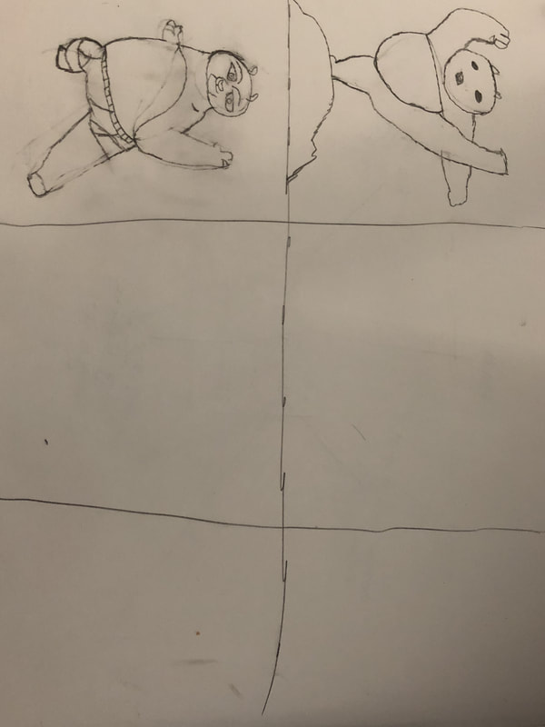
 In progress 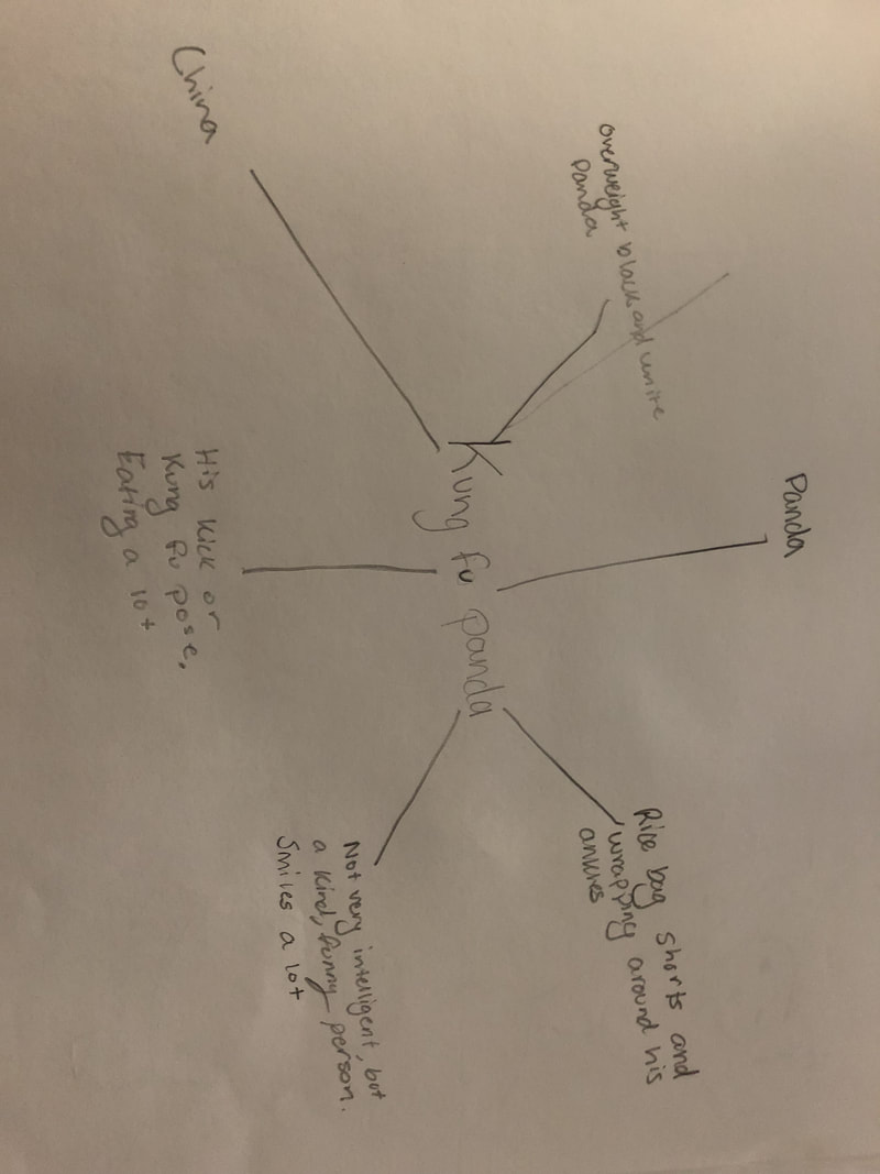 Mind map 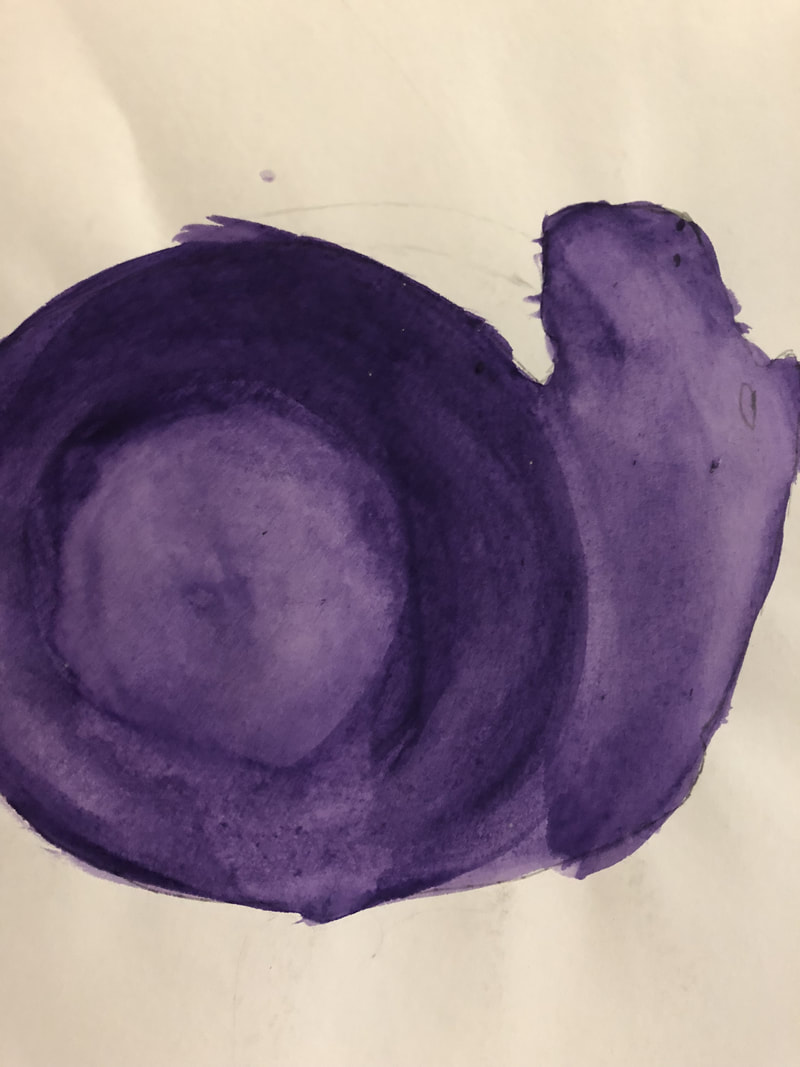 Most helpful warmup I recreated Kung Fu Panda.
In my final piece, which I couldn't find to post, I painted him as a more realistic Panda rather than the very cartoon version of him. I started out by painting Poo then adding in the background and sky. I had to make sure that i stayed within my outlines and the colors I used were exactly what I wanted because painting with watercolors meant I couldn't go back and change the colors. To create lighter colors I added more water to the paint and to create the darker colors I added very little water, because it was hard to mix colors and blend, like we were able to do with acrylic paint. If I had to give advice to someone using watercolor it would be to make sure you know what colors you want to use before you start painting because you can't go back and change them as easily as you can with other painting or drawing styles.
0 Comments
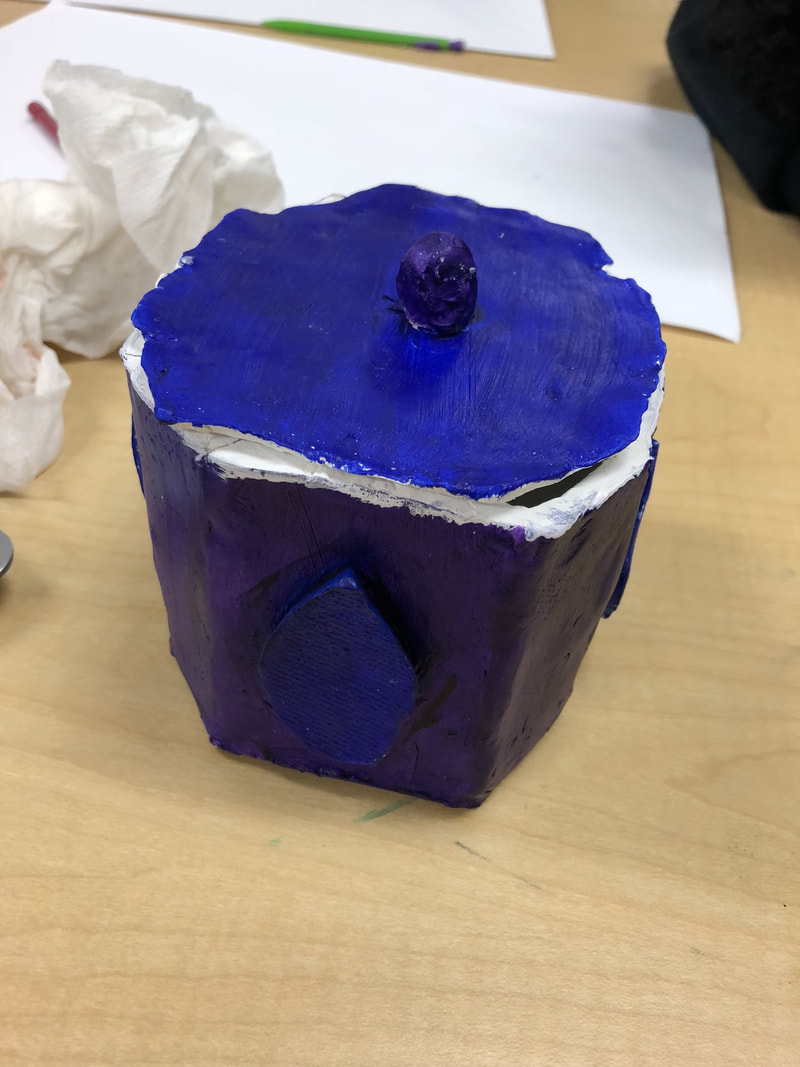 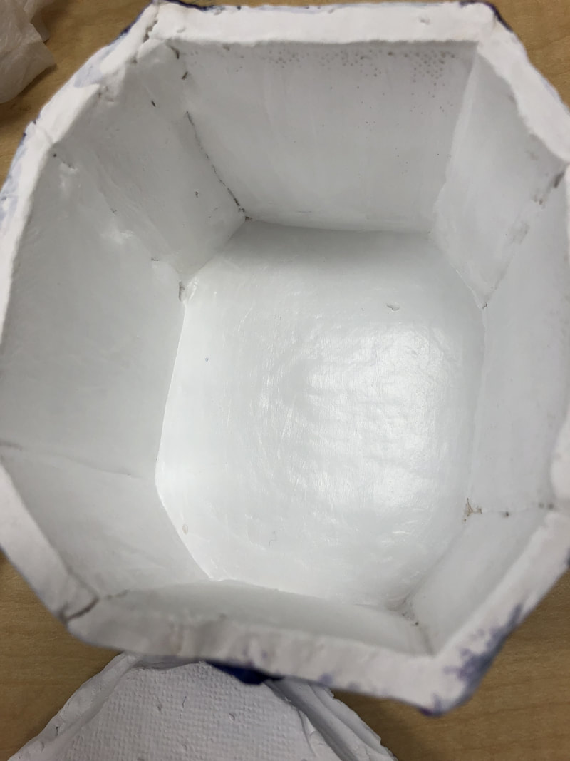 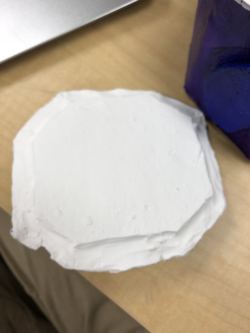 Since the in process post I've added paint and fired my box. I liked my use of color in my finished project. I think the blue and purple contrast came off very well. I would have liked to paint the inside of the box something other than white. The white inside made the box look very tacky and messed up the contrast. The lid was the worst aspect of my box. It shrunk while in was being fired and kind of cracked at the ends. If I could go back and redo my piece the first thing I would do is to redo my lid and make sure it was the right size and didn't have any air bubbles.
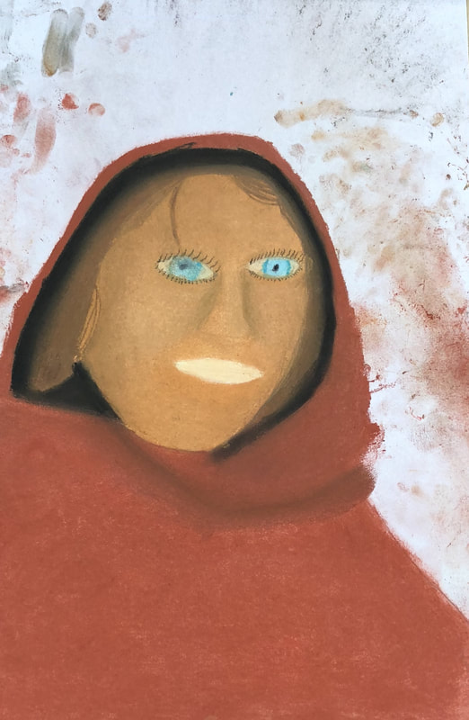 I did my portrait of a picture of my grandmother, which I used chalk pastels to create. I started by drawing out the portrait in pencil and then using the chalk pastels to go in and add details and color. I started with the face then moved on to the hair. From there I added in her scarf and shirt. I then added shadows and the eyes to the piece. My most successful thing about this portrait were the colors. I think I did a good job with the skin colors and the shirt colors, which make it seem more real. I could've done a better job with the shadows and the eye levels, because they were not level. I could've added more texture, especially with the shirt and scarf.
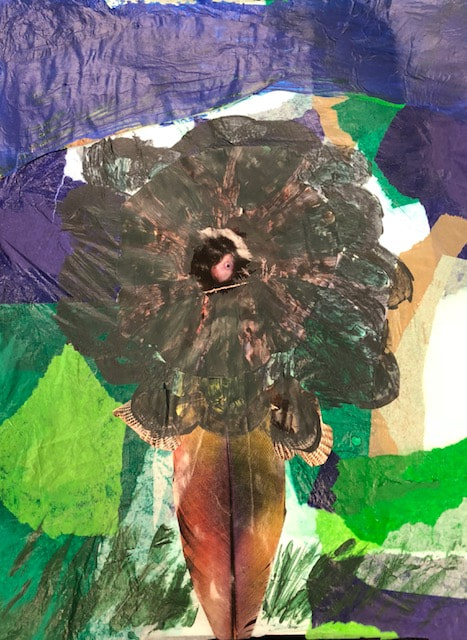 I first used pencil to outline my piece so I would know where every object or color had to go. Then I used the tissue paper, which I ripped up to create the background. The green and brown represent the ground and the blue represents the sky. I then used acrylic paint to paint in the leaves of the flowers. I used the pen tool to outline the grass of the painting, which I then used watercolor to paint in. I also used watercolor to add more details to the sky.
My word was nature and I outlined this by creating a flower. In creating the flower I made by using multiple different aspects of nature such as, a feather, coral, birds, etc. 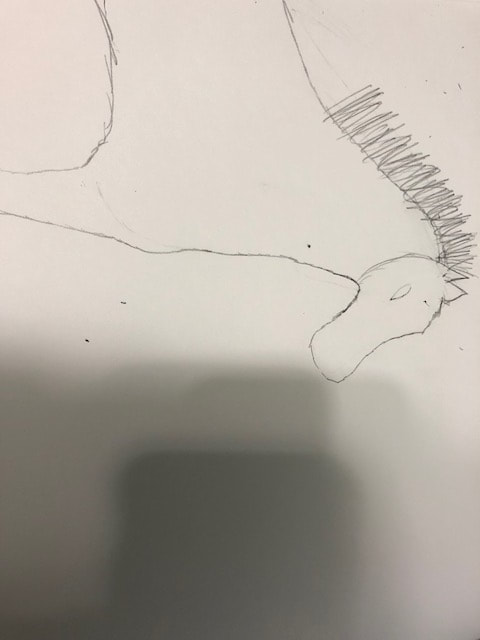 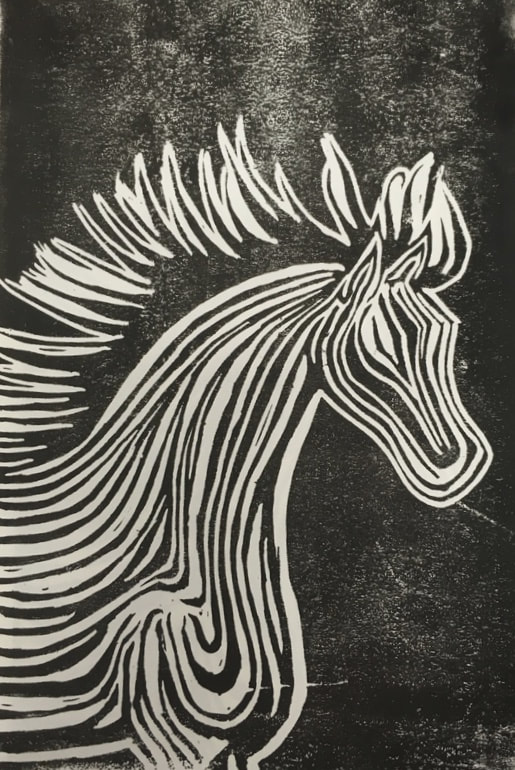 The horse resembles the theme of "line" because it was drawn using multiple lines to create the horse. If I was to do the project again I would rather draw the horse from the front, because getting the lines and details for the horses body were very challenging and time consuming. My piece was successful in giving off the image of a horse and using lines to create the horse. I would also like to redo the mane of the horse, because it almost looks as if the horse is on fire.
Hue Value Scale  Most helpful warm up (skin tone) 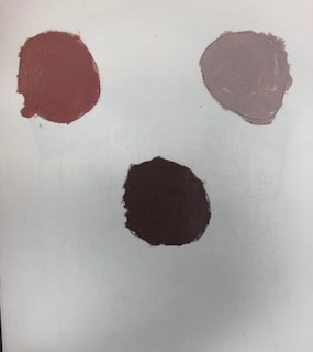 Painting in process  Final painting 
1. My painting is from a street in Girona. It is important to me, because we visit here once a year. 2. The hardest part of the painting was trying to show distance in the painting. It was also hard to paint in the stairs. 3.I think the sky came out the best in my painting. 4. I started by outlining the buildings and stairs. I then painted in multiple different background colors for the multiple different colors that were present in my picture. I then put a coat of paint over the background color, which made the coloring more accurate. After that I added details and added in a rough coat on the buildings to represent the rocks. I then added shadows and touched up the painting.  From this activity I learned how to lighten and darken a certain color. I also learned how to create shadows, because I learned how to make a color slowly appear darker.  I made brown by mixing red and blue to make purple. Then I added yellow to the purple and created brown.
 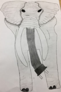 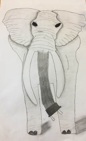  1. I used pencil, because it was the easiest medium for me to add value and shadows to the elephant.
2. I combined a cord and an elephant. 3. On the final piece I started by outlining the head of the elephant, then adding in a rough outline of the ears. Then I drew in the cord and the tusk of the elephant. After that I added in the rest of the body. I then went back in and added detail to the health and the ears. Once that was finished I added in value and wrinkles into the elephant to make it more realistic. I then lightly colored in the elephant, while using a darker shade on the cord. My last step was to add shadows throughout the drawing; under the elephants ears, behind its head, and around its legs. My Mentor was named Lyra. Lyra preferred making drawings or doing 3-D art. Her website is lyracreativeartsquare.weebly.com. This meeting was beneficial for me because I got to learn tricks about different art techniques and we talked about how if you just keep at your artwork you'll improve over time. We also talked about what we would do in the upper level art classes if we choose to take them.
|
Pen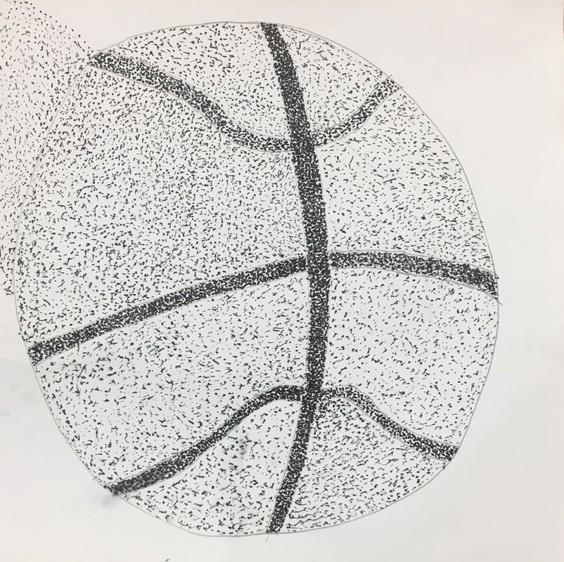
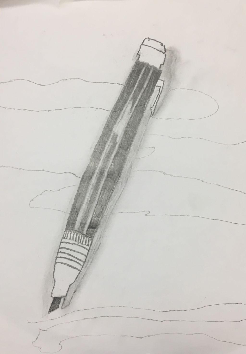
Pencil
charcoal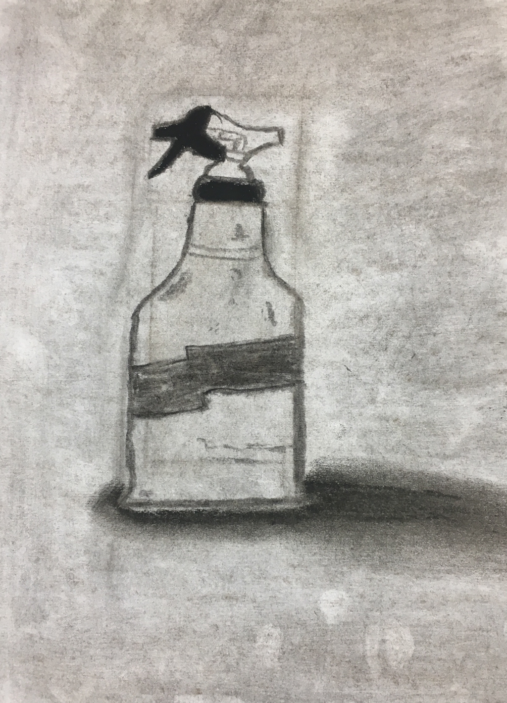
Warm-up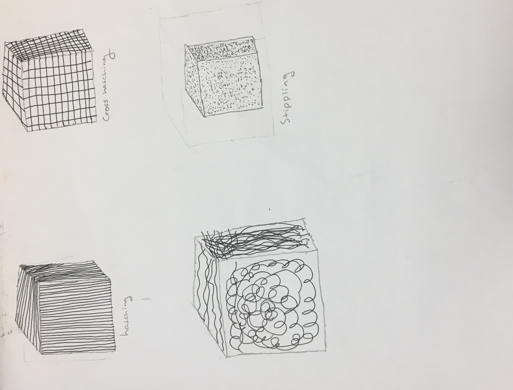
The pen cubes were the most helpful warm-up because it was a good way to teach us of the different styles of pen techniques. It also gave us a reference page that we can use whenever we do pen drawings in the future.
DefinitionsComposition can be defined as something that is made up of multiple elements or ingredients to create a final product such as a color. Value is the level of darkness or lightness you draw a certain color to give the picture more meaning.
Pros-ConsPen was probably the easiest of the drawings to draw and it was the less messy one. The pen drawings were able to look very realistic, the main problem was just that it takes a long time to achieve detail. Stippling takes a long time if your whole drawing has to be stippled. The pencil drawing was realitively easy and it was fun to learn about different values and how to make shadows. It's harder to add values and shadows in a pencil drawing than the other 2 we did. The charcoal drawing was my favorite because it's the easiest to add value to and if you mess up you can just smudge it back in to the background. The main problem with the charcoal drawing is that it's very messy.
|